Eleanor Rigby Instrumental
Focuses: Motion design
Concept: This pieces is about the visual representation of sound, space, and rhythm... it is about music. I will be combining the senses of sight and sound using an instrumental version of the song "Eleanor Rigby" by the beatles. This homage to lonelienss, released in 1966, tells a short story of loneliness featuring A character named Eleanor. The Animation shows a lonely cube in a vast expanse of space. From the outside, it may seem nothing is happening but from the inside, we are overwhelmed with the sheer dynamism happening within.
Final animation
Inspiration Board
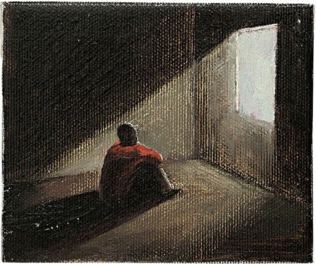
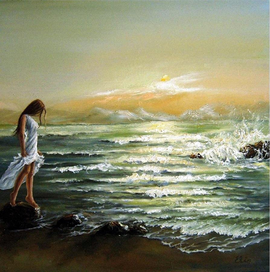
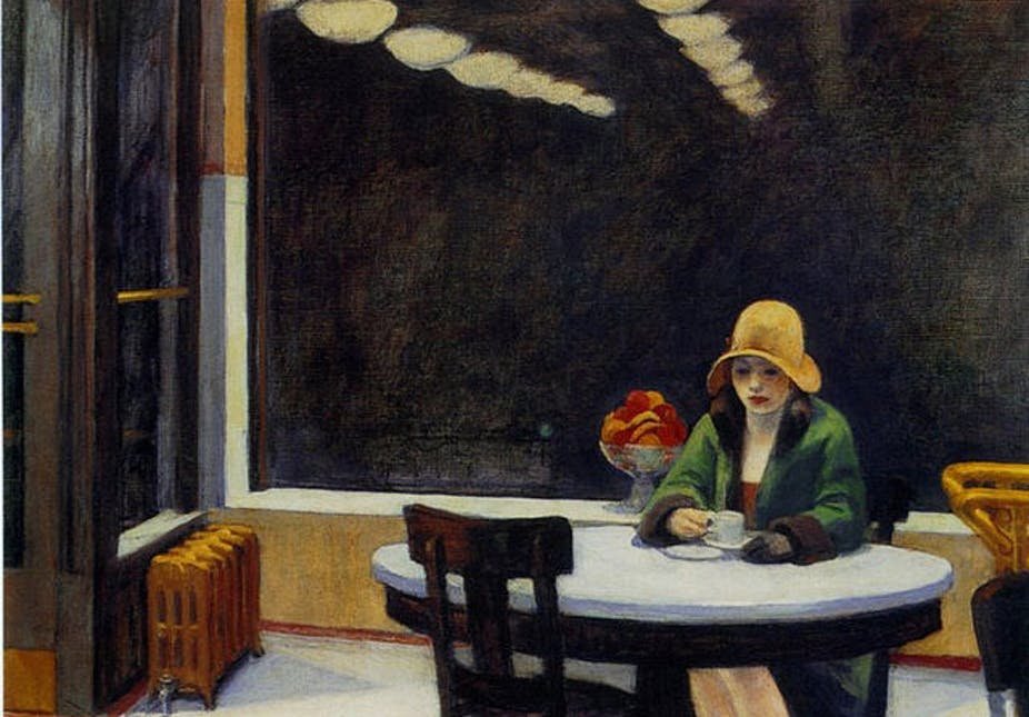
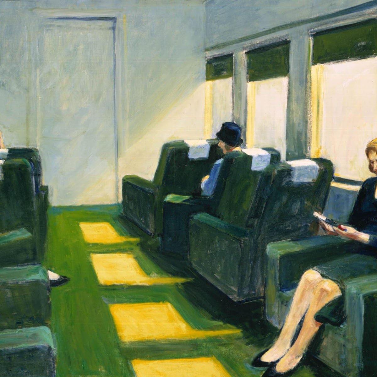
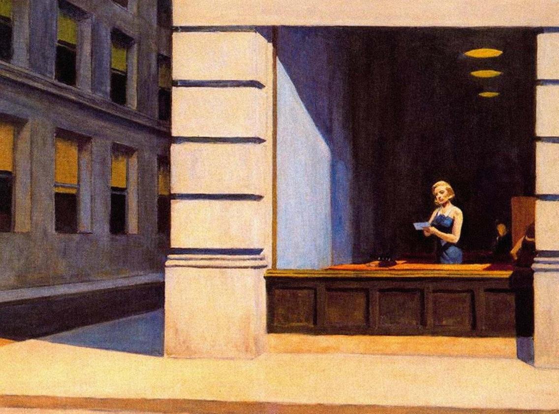
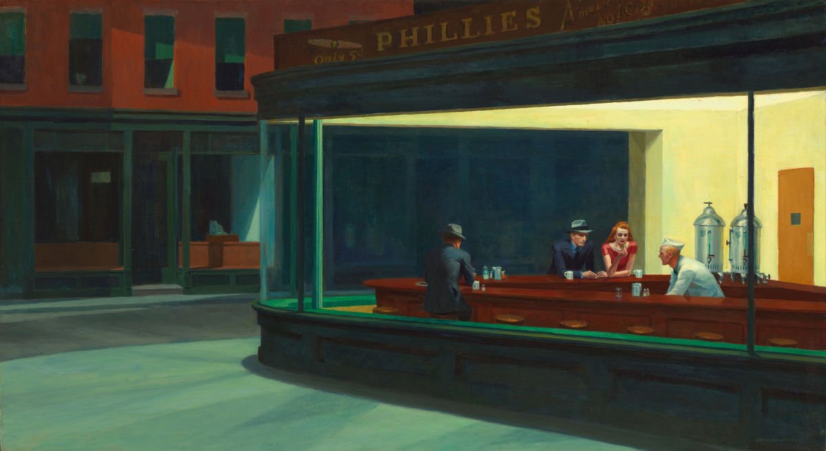
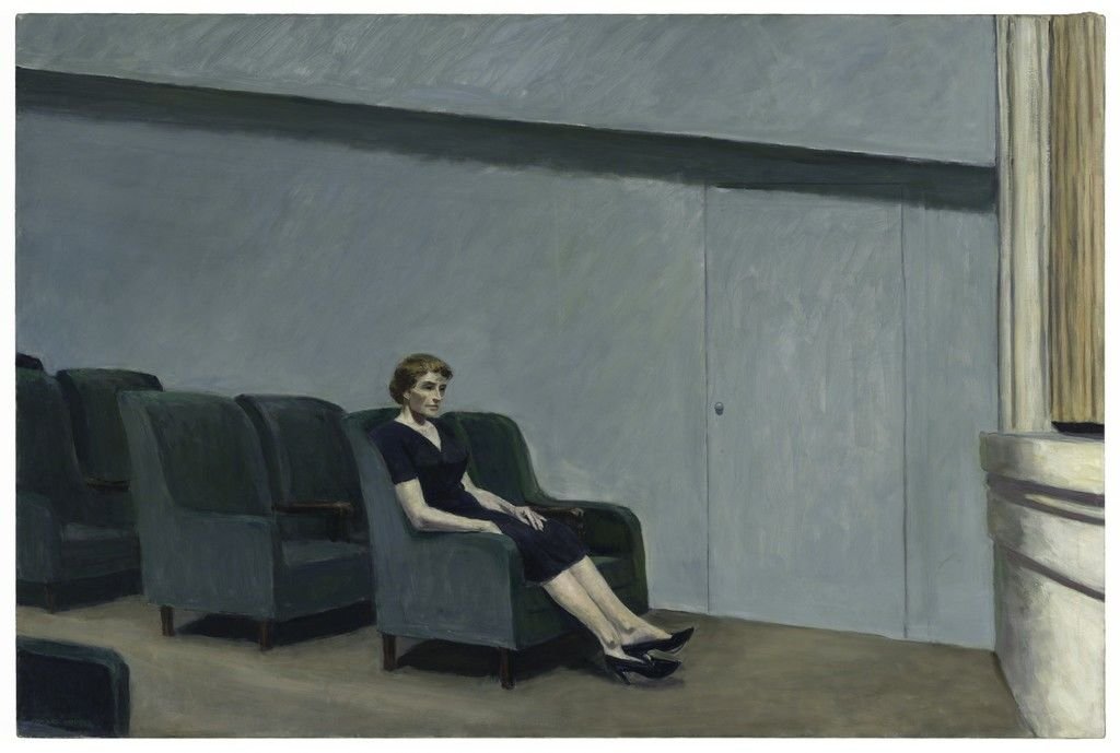
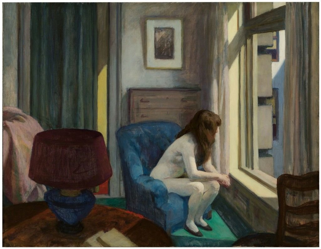
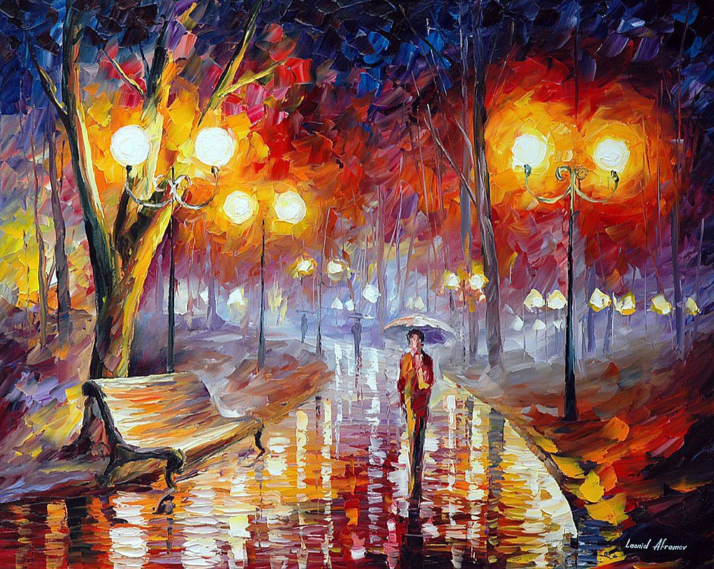
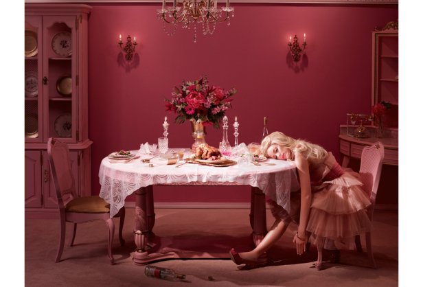
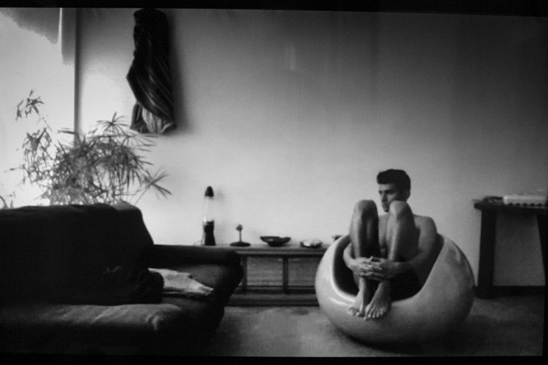
I wanted to explore paintings and photography that feature loneliness at the forefront. This will give me a better idea of how to communicate loneliness in an effective way that does the song justice. From the media shown below, i gather varying degrees of palettes. Some choose to use dull, cool colors while others like the yellow and pink one choose more upbeat colors. I sense those two wish to romanticize loneliness in some way, showing beautiful women occupying empty spaces.
The painting of the woman in the yellow space prompted me to look into The work of Edward Hopper. He into the concept of loneliness. He illustrates this concept well through his dull tones and targeted use of lighting. It also seems he obstructs the faces of his figures half the time.
His color palettes are interesting and, i feel, worth bringing into my motion graphic. I find it interesting how he uses predominantly warm tones that have been desaturated and darkened in every painting except the one with the woman in the blue chair. Most have yellow, maroon, turquoise, and beige.

Process Work
Sound diagram featuring 5 instruments
Storyboard
Digital collage using elements from animation
Sample Keyframes
Final animation
